Overview
Contributions:
UX design
Visual design
Graphic design for media
Usability research
Product management
Tools used:
Omnigraffle
Photoshop/Illustrator
Baslamiq
Asana
Google Analytics
The problem to solve
The team responsible for Bronchial Thermoplasty at Boston Scientific needed help renovating their website, their most important marketing asset, which hadn't been through a design update in years. Bronchial Thermoplasty was a landmark, breakthrough procedure in asthma therapy, but their web presence wasn't effectively representing this innovation to prospective patients and physicians. I was brought on as a product management and user experience design consultant to help the team tell their story.
Audit & research
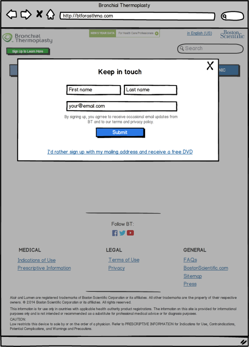
The original website followed the rules of older web design — content above the fold, a lot of text, and multiple calls to action:
The original BTforAsthma.com website.
To start, I created an inventory of all the website's pages (a current sitemap did not exist) and visualized the flow for the team.
From there, the team shared the deep user segmentation research they had already done and walked through each user persona with me, so I could understand and empathize with the website's end users.
I also put together a competitive site assessment to help the BT for Asthma website truly stand out in the category.
Recommended approach
Working with the team, I uncovered the compelling story the website needed to tell to help educate physicians and patients with severe asthma what this new procedure was and help them determine whether it was right for them. After mapping out the high-level story and user flows, I consolidated the site and removed any unnecessary content or repetition. The resulting architecture was simpler, SEO friendly, and accessible:
Over the course of the project, the scope changed in order to meet Boston Scientific's global website design requirements, so I developed a more robust, multilingual sitemap:
Wireframes
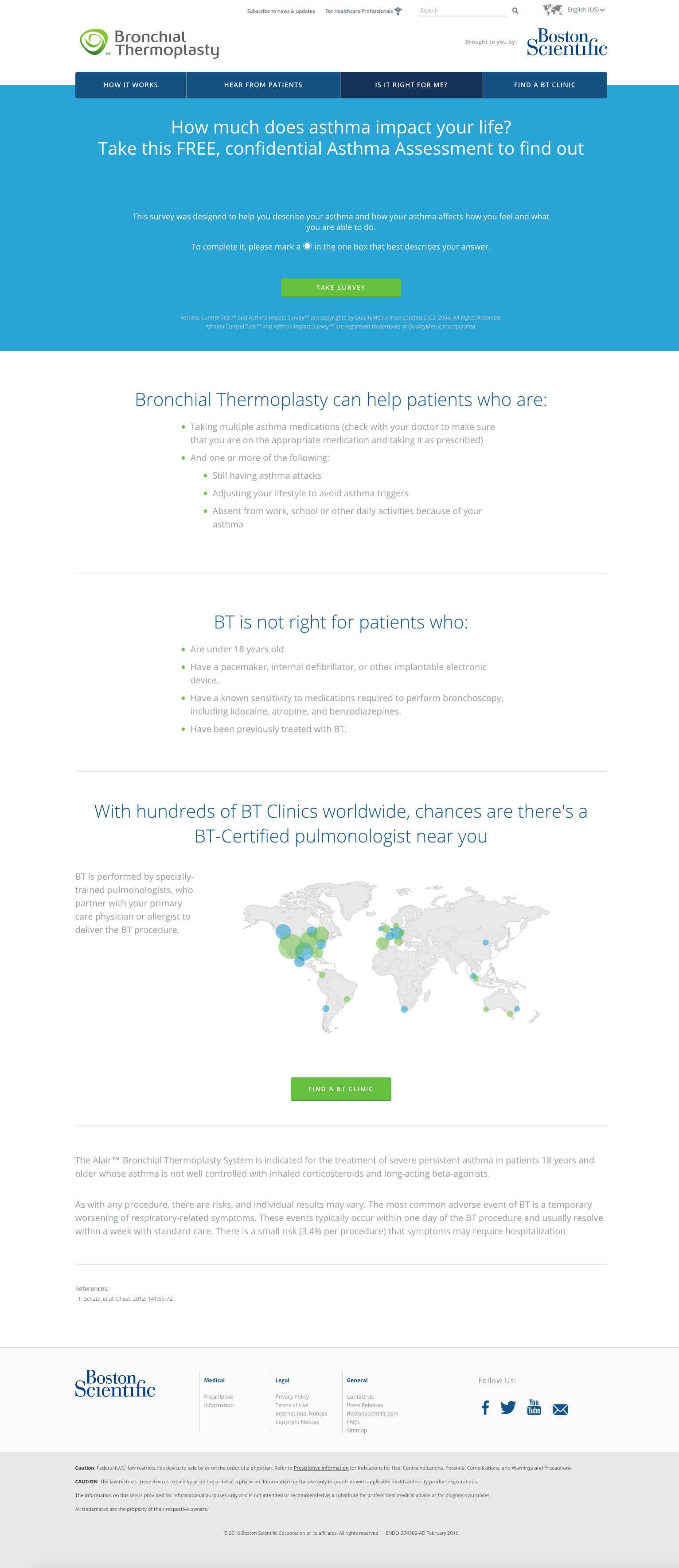
With the user flows, site architecture, and brand story identified, I designed the wireframes for each page of the new website. We kept one call to action visible on screen, whenever possible, and worked with long, scrollable pages that kept users engaged.
Iteration
Because the wireframes were high fidelity enough to resemble a website, I conducted a series of usability tests to ensure the flows were intuitive. Observation uncovered several accessibility issues, so I adjusted the wireframes accordingly and ran another series of tests. From there, we knew we were ready to start development.
The final product
To save time, I brought in an awesome front end developer team I'd worked with before to implement the designs, along with a talented geo developer who helped us implement the critical "find a clinic" tool.
The team also needed visual design work done, complementing the style of the website. Working quickly, I created cohesive display advertising artwork to drive the growth the team needed to see.
Results
Our initial launch was a success: with the help of my wireframes, detailed project plan, and requirements document, we launched the new website smoothly and ahead of schedule.
The result was not just a refreshed web presence, but the beginning of a new way of thinking about their website, as a continually evolving story telling tool. Now, user testing and user feedback is regularly scheduled and tweaks and improvements were made even within one month after the new website launched.


